AMC Health Park
Our design embarked upon connecting people back to the polder system that was once there.
read more



AMC Health Park
Our design embarked upon connecting people back to the polder system that was once there.
read more


AMC Health Park, Amsterdam
Scope: Winning tender, Concept design, Developed design, Technical Design
Partners: Studio Nuy van Noort, Temp Architecture, Gryllus Advies
Client: Amsterdam UMC
Year: 2017 – 2022
Photography: Angelina Nikolayeva, MWA Hart Nibbrig Photography
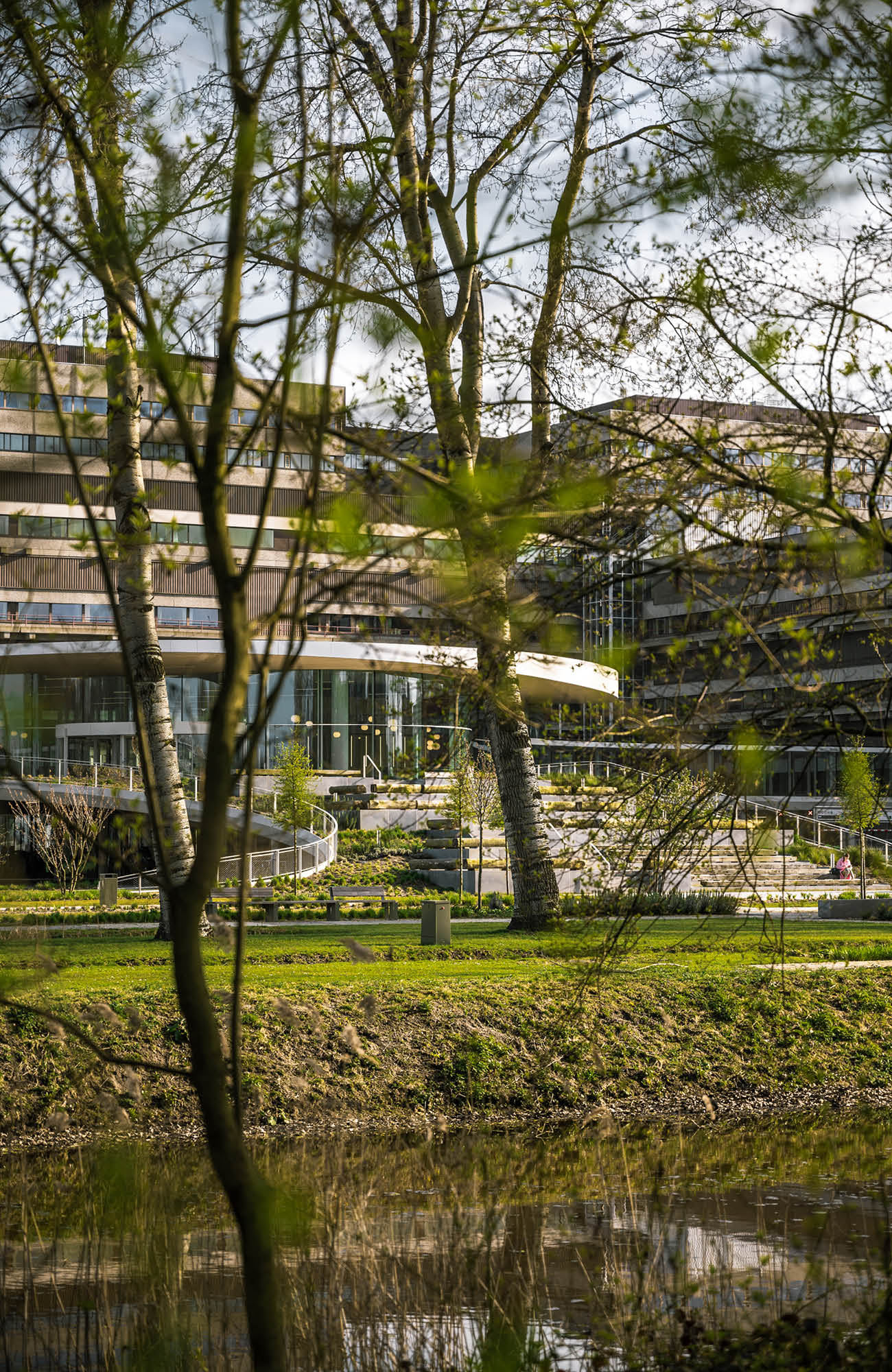
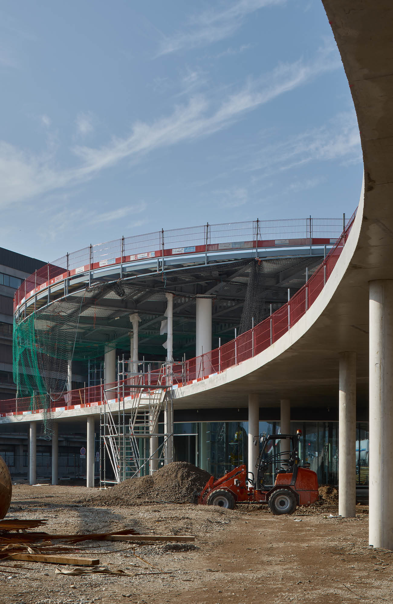
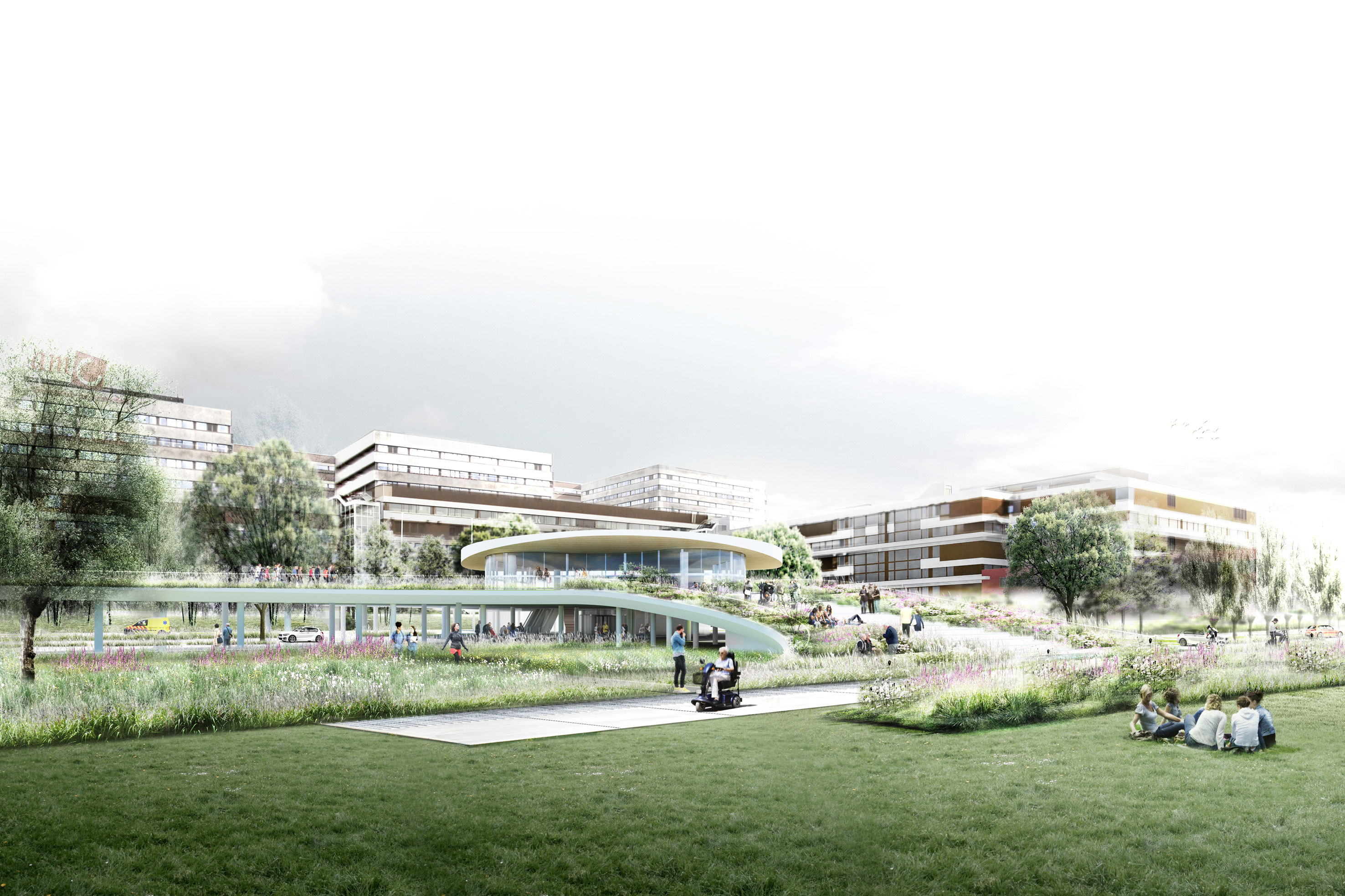
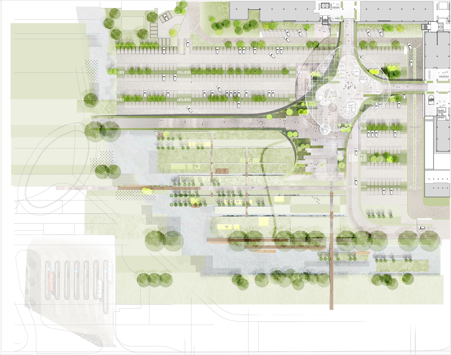
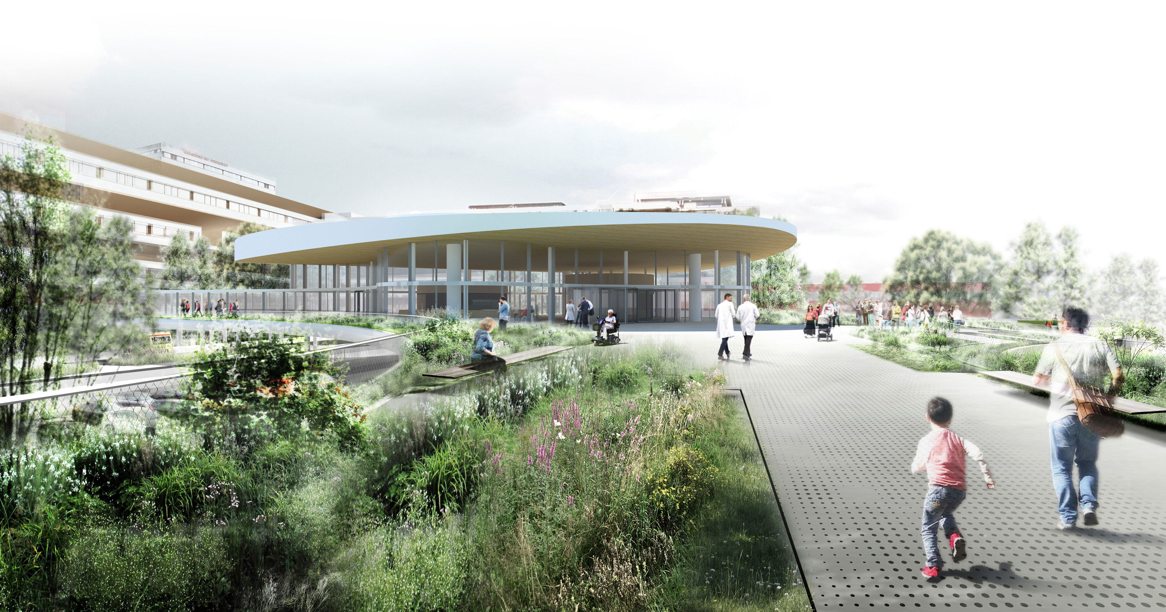
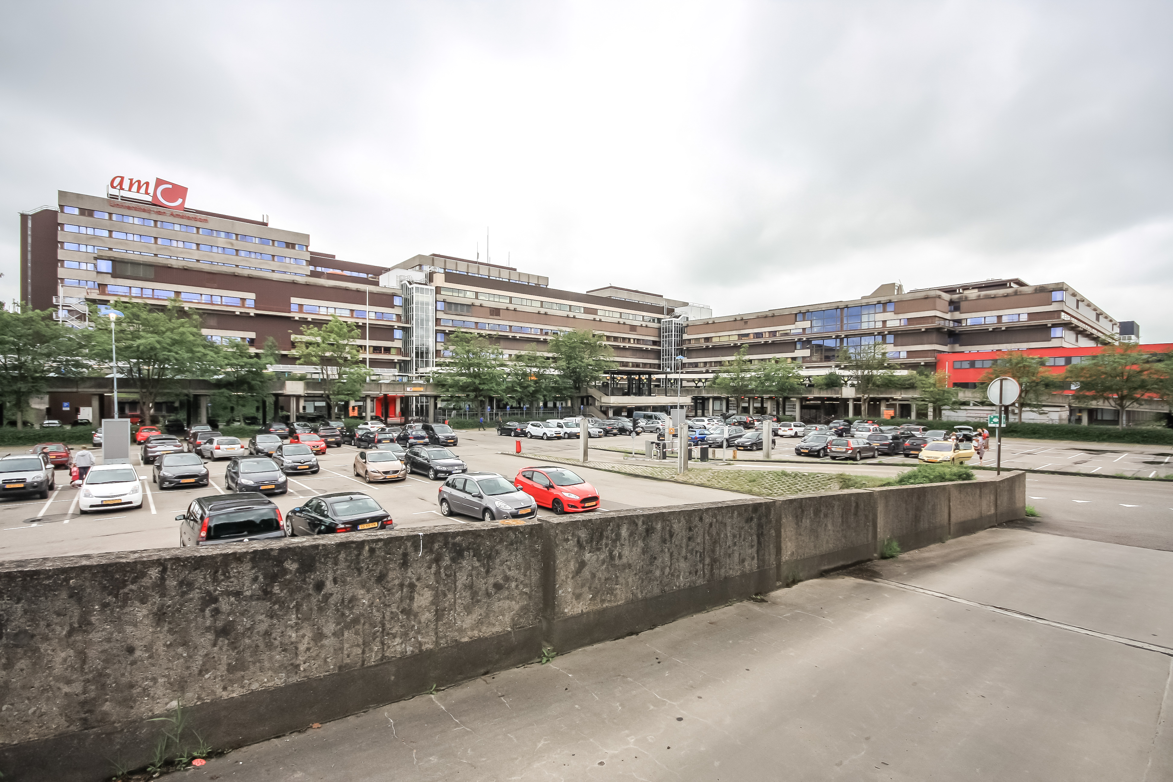
For most of us, hospitals are places we try to avoid. We visit them when we, or someone we love is unwell. Tension and uncertainty during these visits are already high and the existing design of the Amsterdam Medical Centre was only making matters worse; signposting was unclear and visitors were confused which entrance to use and where to park. BLAD, alongside, Studio Nuy Van Noort and Temp Architecture were briefed to redesign the entrance and carpark into a space that would filter visitors to the right area of the hospital and update the 1970s design. Our first impressions of the site were that of a fortress, a claustrophobic concrete environment that was further isolating patients and visitors, a place void of a connection to nature. Looking South East beyond the hospitals boundaries we could see the Dutch polder system, a sight synonymous with the Dutch countryside. The lane like formations in a polder system allow you to look hundreds of metres ahead evoking openness and quiet contemplation. It was this feeling that was the starting point for our solution. Our design embarked upon breaking down the fortress and connecting people back into the larger story and the polder system that was once there.
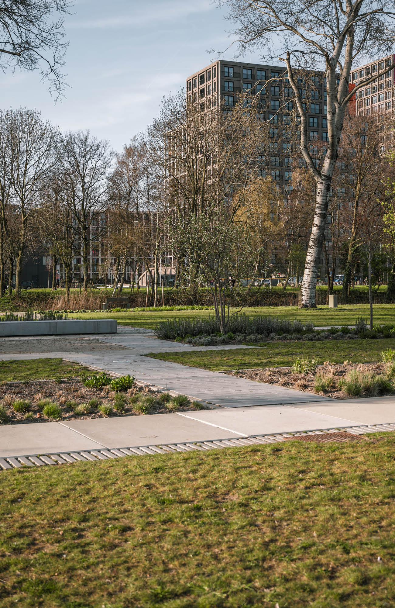
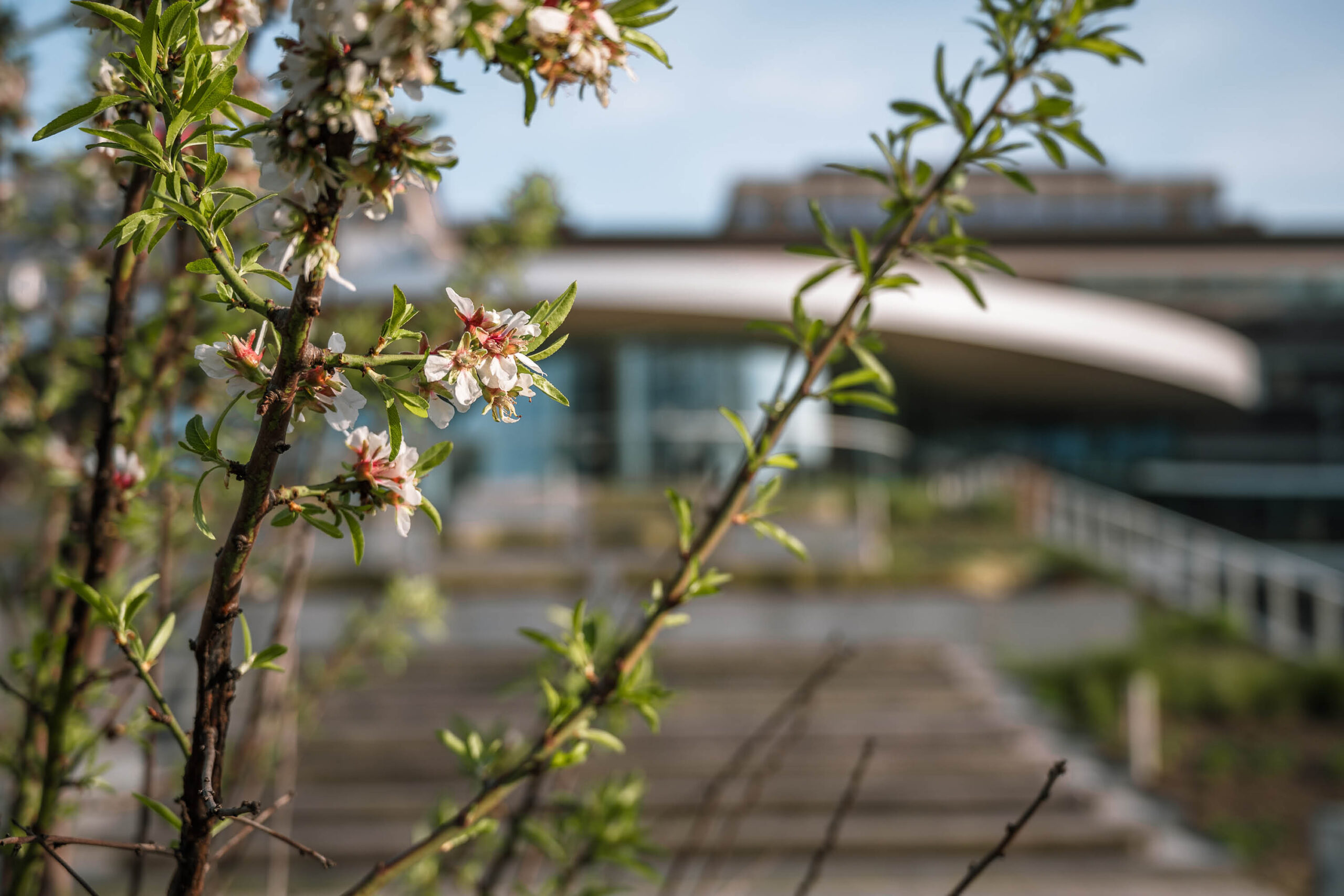
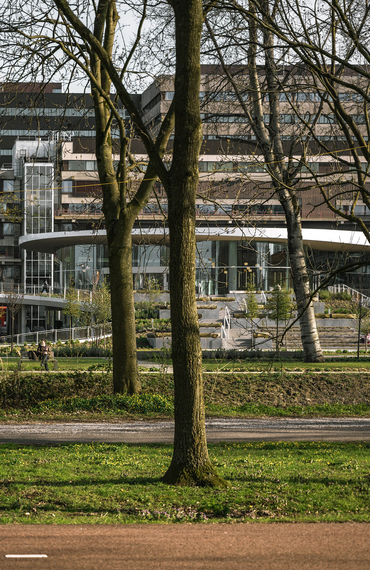
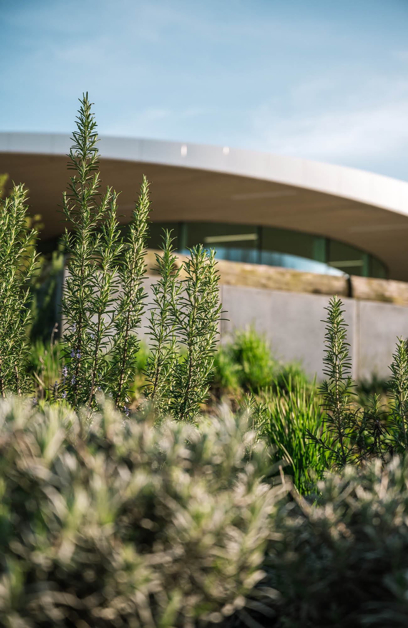
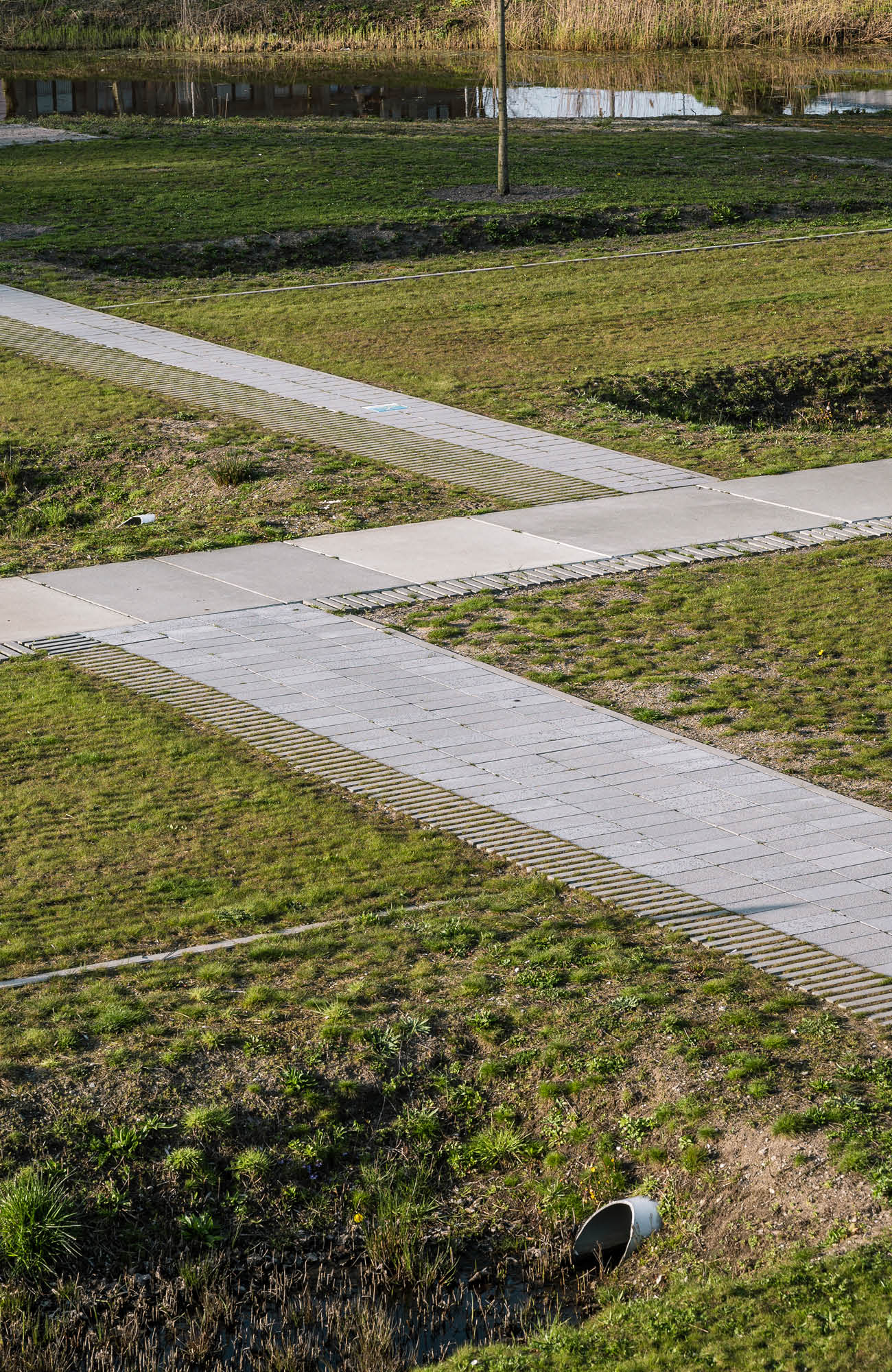
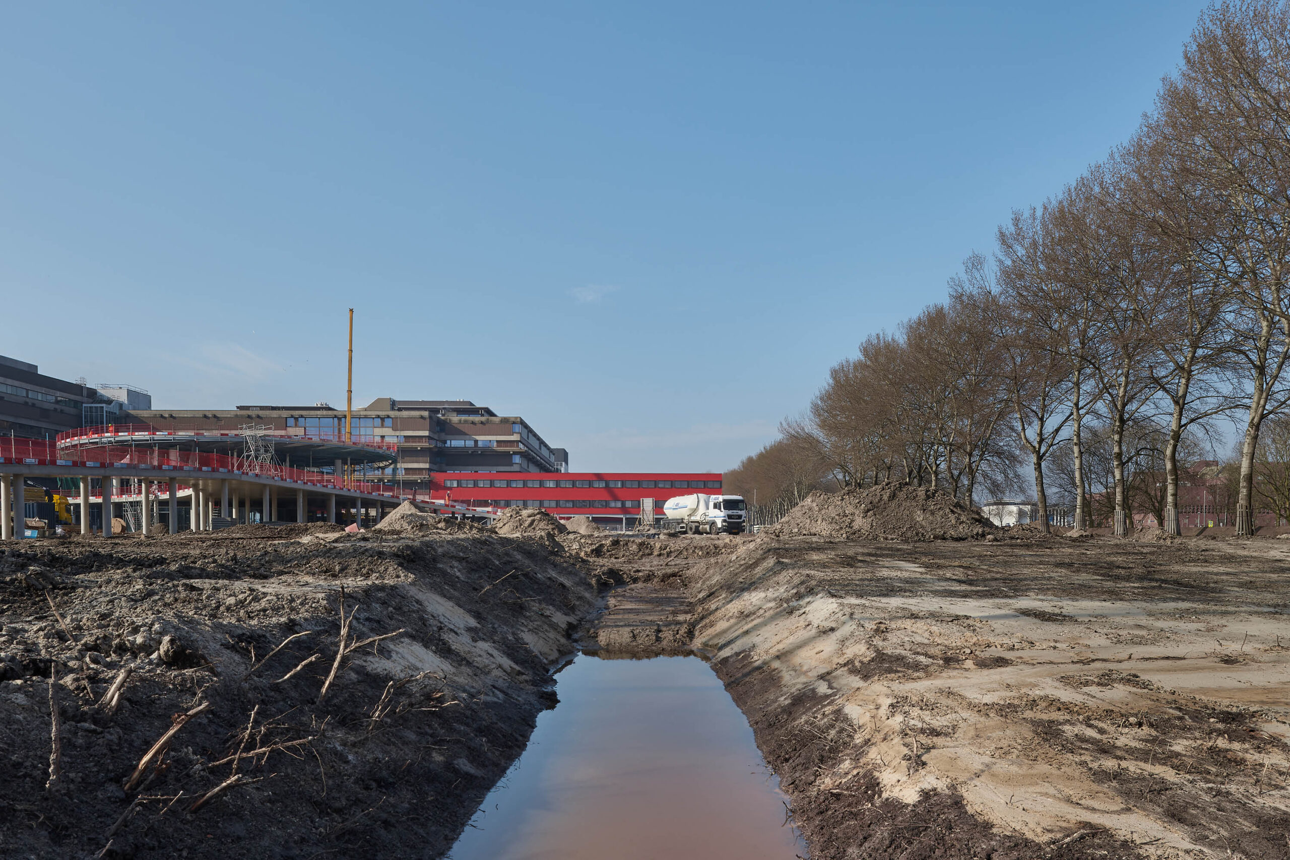
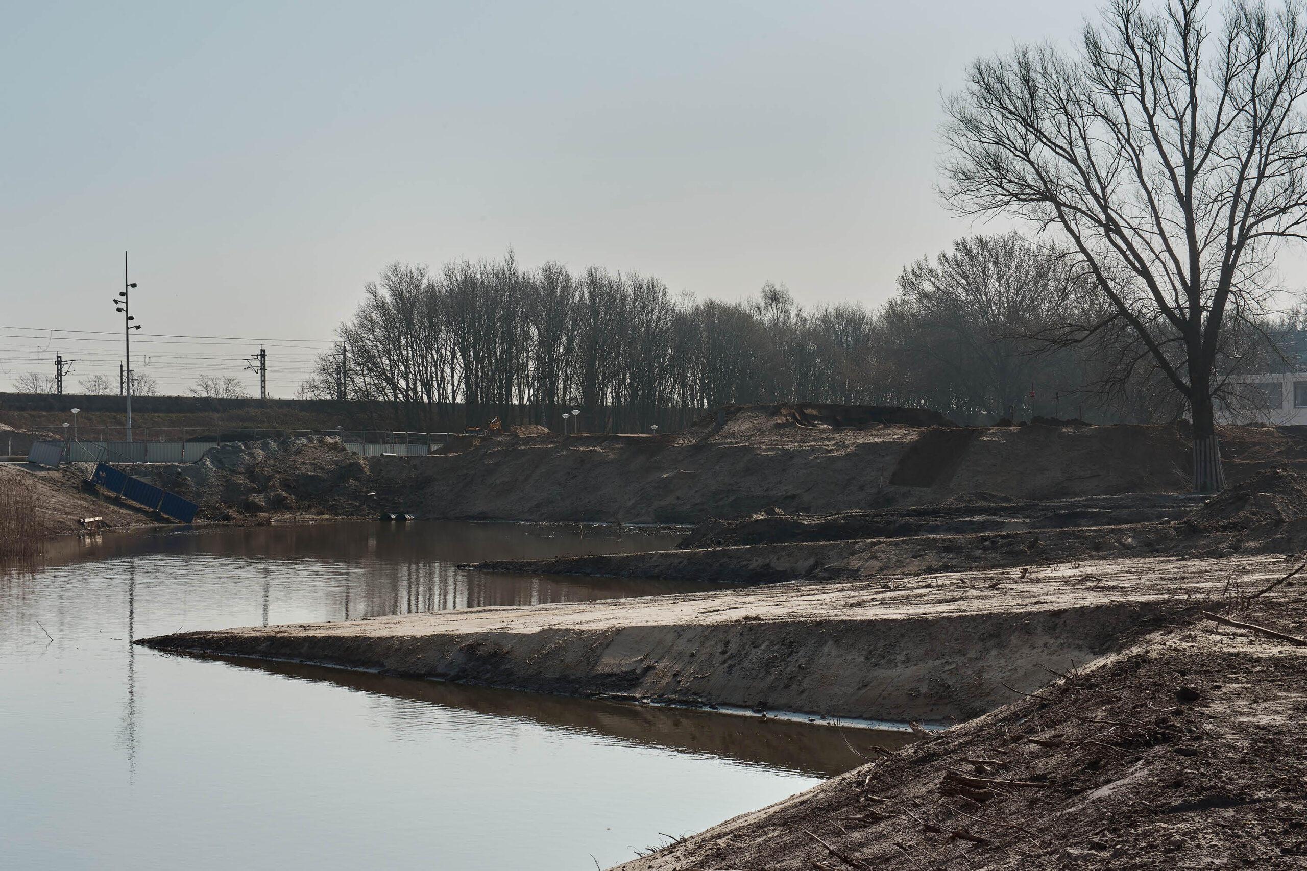
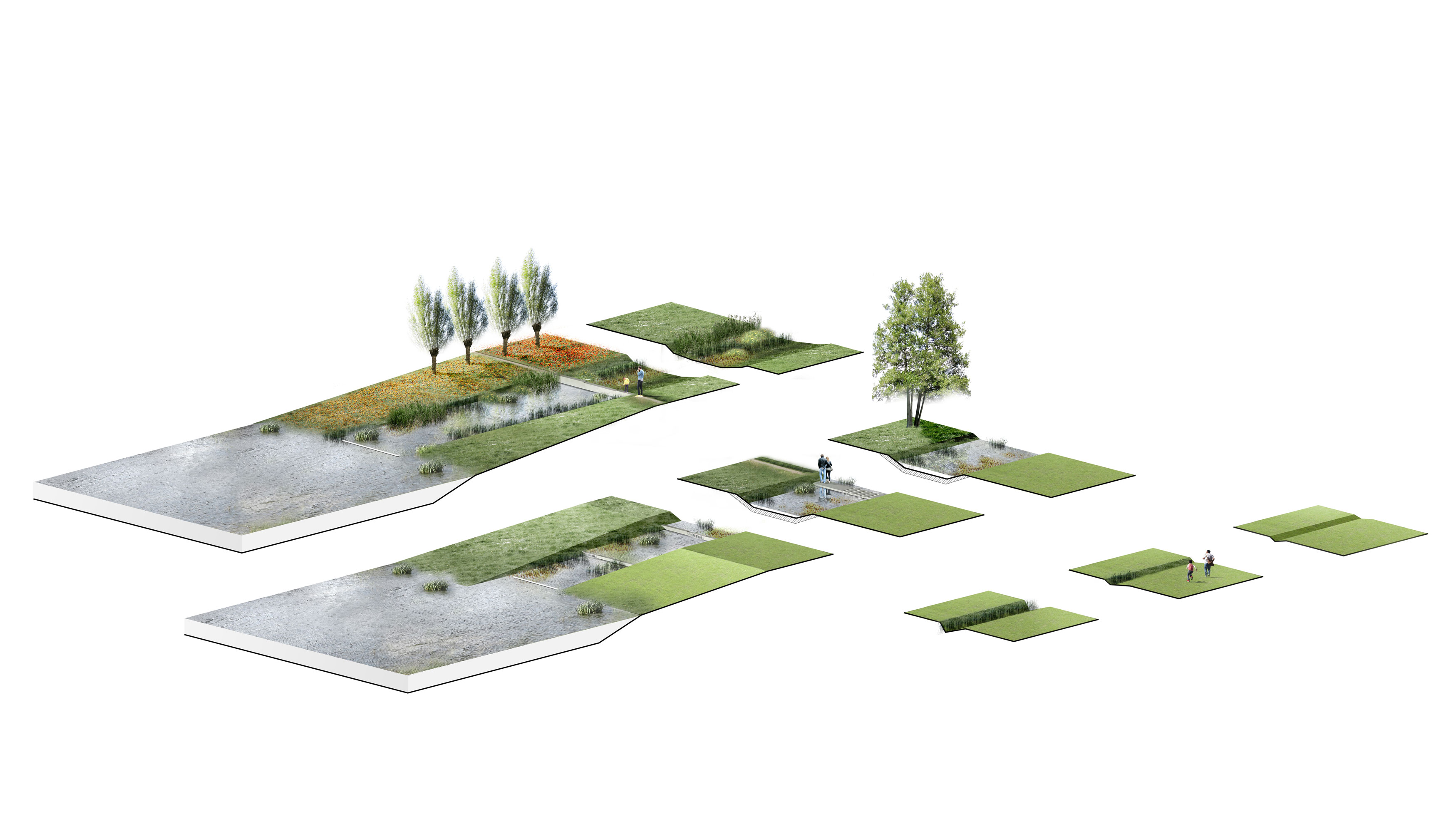
From visits to the site, we observed the way patients used the outdoor area. Many were being wheeled out with medical equipment attached which meant they couldn’t go very far. It was for this purpose we created different layers.For the first layer immediately surrounding the hospital and the most likely the furthest distance possible for the sickest patients, we turned up the dial, using colourful flowers and fragrant medical herbs to connect the patients into the outdoor environment.The second and third layers graduate to a wilder landscape, allowing more freedom and represents the journey of recovery as patients are able to embark further beyond the hospital building. The structure emulates the polder landscape – linear water channels and swales, the path system and the tree lanes. All the trees and planting are native to the polder system and enforce the connection to the wider landscape and back to the site’s origins. We created areas that allow patients the privacy of walk with a loved one and time for solitary reflection in contrast to their sterilised rooms and treatment facilities. There is also an area of gravel that can be used for outdoor rehabilitation of patients.
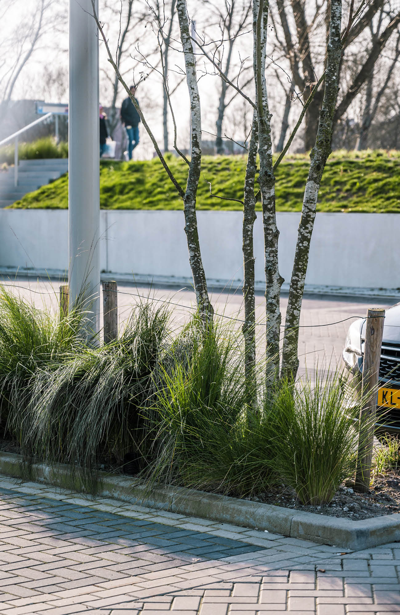
While there was a temptation to hide the carpark underground and allow room to play with, we realised that this would mean, after visitors parked their car they would get into an elevator and bypass all the natural surroundings. Instead, we proposed the carparks sit within the landscape which gives visitors time as they arrive and leave to feel a part of the natural surroundings and something bigger than themselves.
